实例介绍
【实例截图】




【核心代码】
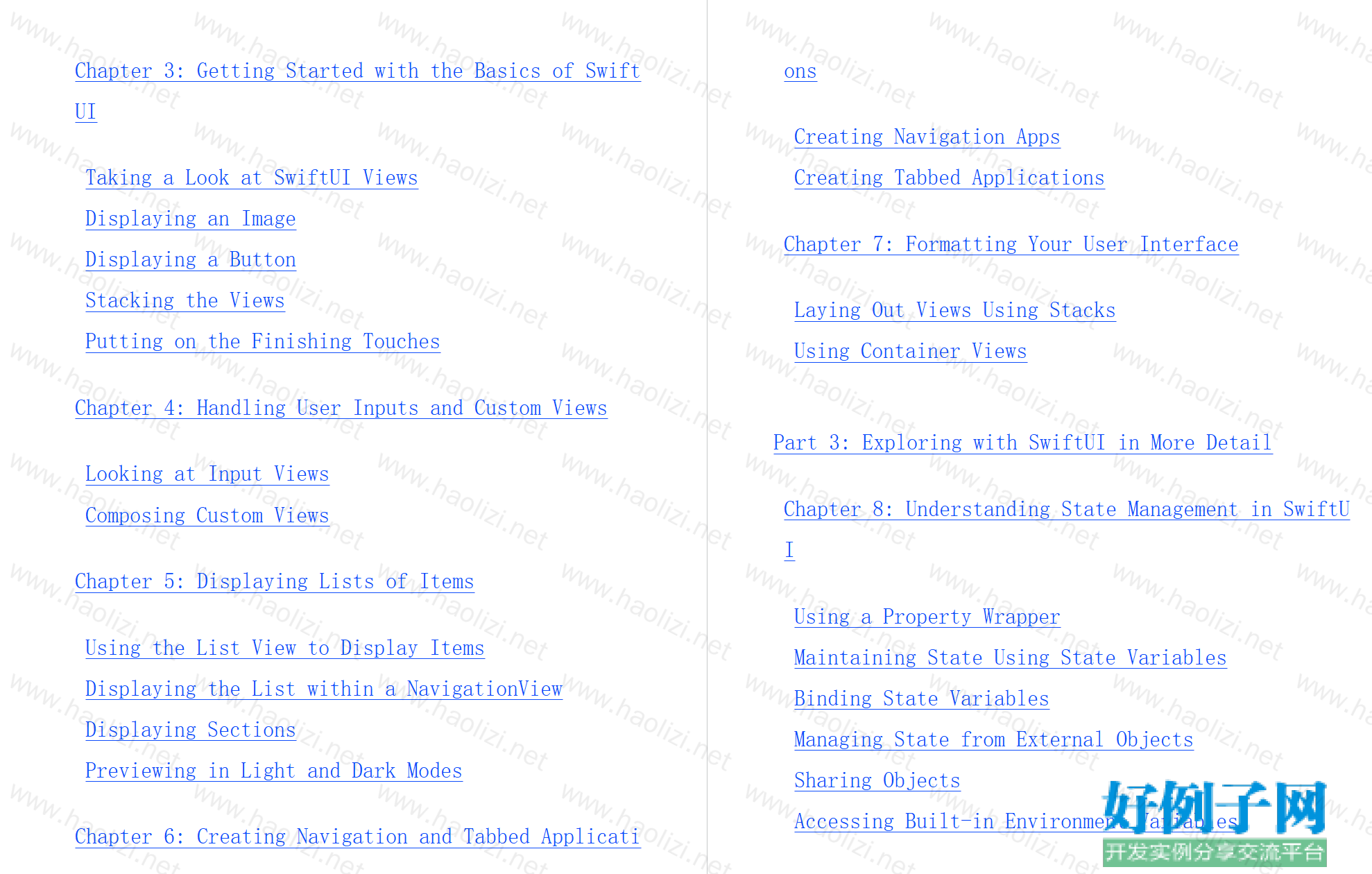
Table of Contents
Cover
Introduction
About This Book
Foolish Assumptions
Icons Used in This Book
Beyond the Book
Where to Go from Here
Part 1: Getting Started with Swift and SwiftUI
Chapter 1: Introducing SwiftUI
Understanding What SwiftUI Is
Getting the Tools
The Gory Details
Chapter 2: Basics of the Swift Programming Language
Basic Swift Syntax
Basic Data Types
Arrays
Dictionaries
Optional Types
Functions
Flow Control
Looping
Structures
Classes
Closures
Protocols
Part 2: Understanding the Basics of SwiftUI
Chapter 3: Getting Started with the Basics of SwiftUI
Taking a Look at SwiftUI Views
Displaying an Image
Displaying a Button
Stacking the Views
Putting on the Finishing Touches
Chapter 4: Handling User Inputs and Custom Views
Looking at Input Views
Composing Custom Views
Chapter 5: Displaying Lists of Items
Using the List View to Display Items
Displaying the List within a NavigationView
Displaying Sections
Previewing in Light and Dark Modes
Chapter 6: Creating Navigation and Tabbed Applications
Creating Navigation Apps
Creating Tabbed Applications
Chapter 7: Formatting Your User Interface
Laying Out Views Using Stacks
Using Container Views
Part 3: Exploring with SwiftUI in More Detail
Chapter 8: Understanding State Management in SwiftUI
Using a Property Wrapper
Maintaining State Using State Variables
Binding State Variables
Managing State from External Objects
Sharing Objects
Accessing Built-in Environment Variables
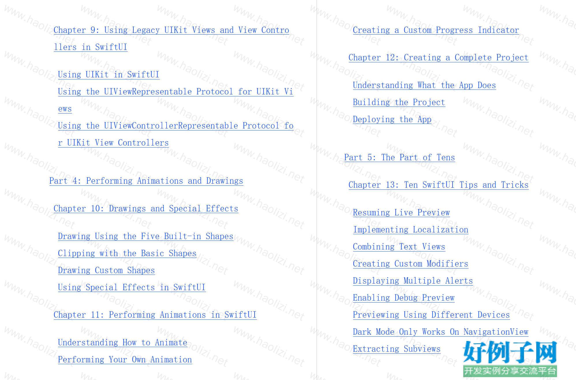
Chapter 9: Using Legacy UIKit Views and View Controllers in SwiftUI
Using UIKit in SwiftUI
Using the UIViewRepresentable Protocol for UIKit Views
Using the UIViewControllerRepresentable Protocol for UIKit View Controllers
Part 4: Performing Animations and Drawings
Chapter 10: Drawings and Special Effects
Drawing Using the Five Built-in Shapes
Clipping with the Basic Shapes
Drawing Custom Shapes
Using Special Effects in SwiftUI
Chapter 11: Performing Animations in SwiftUI
Understanding How to Animate
Performing Your Own Animation
Creating a Custom Progress Indicator
Chapter 12: Creating a Complete Project
Understanding What the App Does
Building the Project
Deploying the App
Part 5: The Part of Tens
Chapter 13: Ten SwiftUI Tips and Tricks
Resuming Live Preview
Implementing Localization
Combining Text Views
Creating Custom Modifiers
Displaying Multiple Alerts
Enabling Debug Preview
Previewing Using Different Devices
Dark Mode Only Works On NavigationView
Extracting Subviews
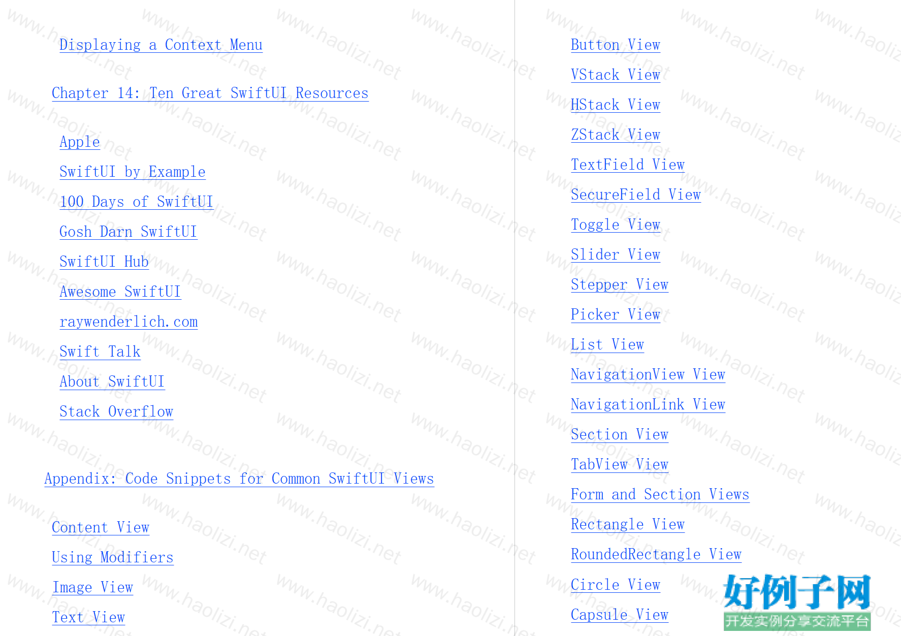
Displaying a Context Menu
Chapter 14: Ten Great SwiftUI Resources
Apple
SwiftUI by Example
100 Days of SwiftUI
Gosh Darn SwiftUI
SwiftUI Hub
Awesome SwiftUI
raywenderlich.com
Swift Talk
About SwiftUI
Stack Overflow
Appendix: Code Snippets for Common SwiftUI Views
Content View
Using Modifiers
Image View
Text View
Button View
VStack View
HStack View
ZStack View
TextField View
SecureField View
Toggle View
Slider View
Stepper View
Picker View
List View
NavigationView View
NavigationLink View
Section View
TabView View
Form and Section Views
Rectangle View
RoundedRectangle View
Circle View
Capsule View
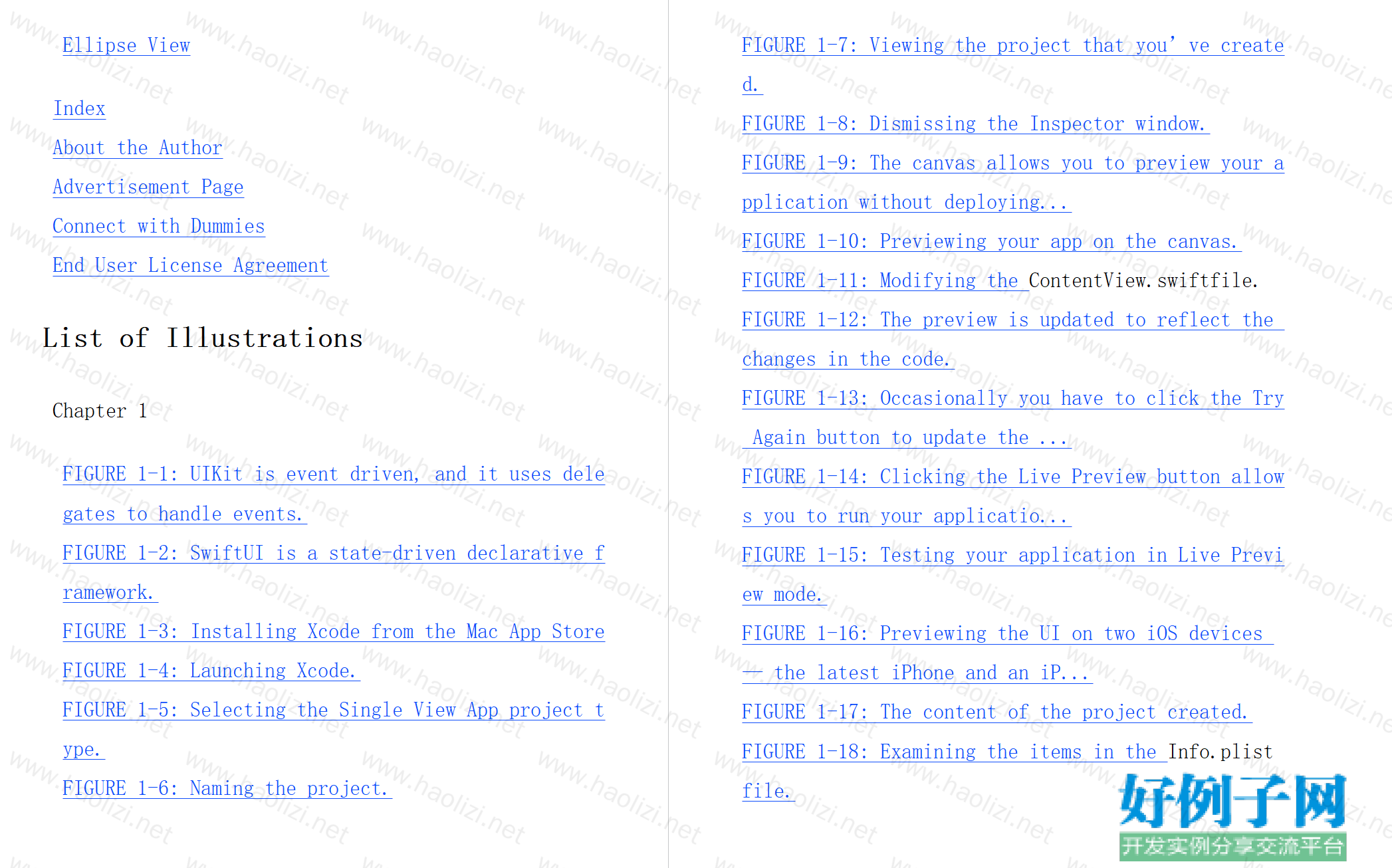
Ellipse View
Index
About the Author
Advertisement Page
Connect with Dummies
End User License Agreement
List of Illustrations
Chapter 1
FIGURE 1-1: UIKit is event driven, and it uses delegates to handle events.
FIGURE 1-2: SwiftUI is a state-driven declarative framework.
FIGURE 1-3: Installing Xcode from the Mac App Store
FIGURE 1-4: Launching Xcode.
FIGURE 1-5: Selecting the Single View App project type.
FIGURE 1-6: Naming the project.
FIGURE 1-7: Viewing the project that you’ve created.
FIGURE 1-8: Dismissing the Inspector window.
FIGURE 1-9: The canvas allows you to preview your application without deploying...
FIGURE 1-10: Previewing your app on the canvas.
FIGURE 1-11: Modifying the ContentView.swiftfile.
FIGURE 1-12: The preview is updated to reflect the changes in the code.
FIGURE 1-13: Occasionally you have to click the Try Again button to update the ...
FIGURE 1-14: Clicking the Live Preview button allows you to run your applicatio...
FIGURE 1-15: Testing your application in Live Preview mode.
FIGURE 1-16: Previewing the UI on two iOS devices — the latest iPhone and an iP...
FIGURE 1-17: The content of the project created.
FIGURE 1-18: Examining the items in the Info.plistfile.
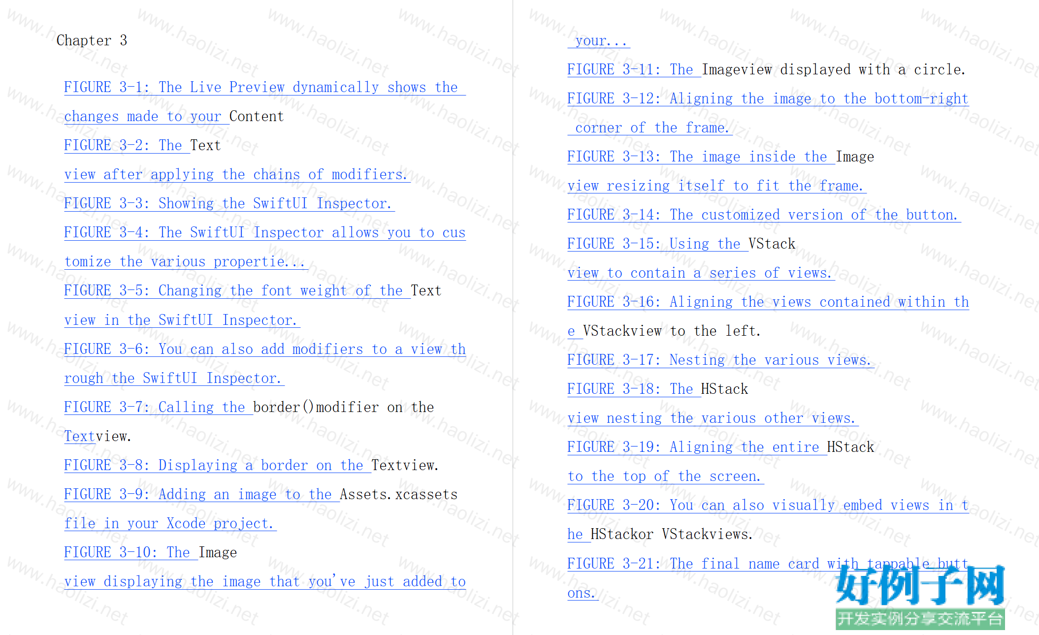
Chapter 3
FIGURE 3-1: The Live Preview dynamically shows the changes made to your Content
FIGURE 3-2: The Textview after applying the chains of modifiers.
FIGURE 3-3: Showing the SwiftUI Inspector.
FIGURE 3-4: The SwiftUI Inspector allows you to customize the various propertie...
FIGURE 3-5: Changing the font weight of the Textview in the SwiftUI Inspector.
FIGURE 3-6: You can also add modifiers to a view through the SwiftUI Inspector.
FIGURE 3-7: Calling the border()modifier on the Textview.
FIGURE 3-8: Displaying a border on the Textview.
FIGURE 3-9: Adding an image to the Assets.xcassetsfile in your Xcode project.
FIGURE 3-10: The Imageview displaying the image that you've just added to your...
FIGURE 3-11: The Imageview displayed with a circle.
FIGURE 3-12: Aligning the image to the bottom-right corner of the frame.
FIGURE 3-13: The image inside the Imageview resizing itself to fit the frame.
FIGURE 3-14: The customized version of the button.
FIGURE 3-15: Using the VStackview to contain a series of views.
FIGURE 3-16: Aligning the views contained within the VStackview to the left.
FIGURE 3-17: Nesting the various views.
FIGURE 3-18: The HStackview nesting the various other views.
FIGURE 3-19: Aligning the entire HStackto the top of the screen.
FIGURE 3-20: You can also visually embed views in the HStackor VStackviews.
FIGURE 3-21: The final name card with tappable buttons.
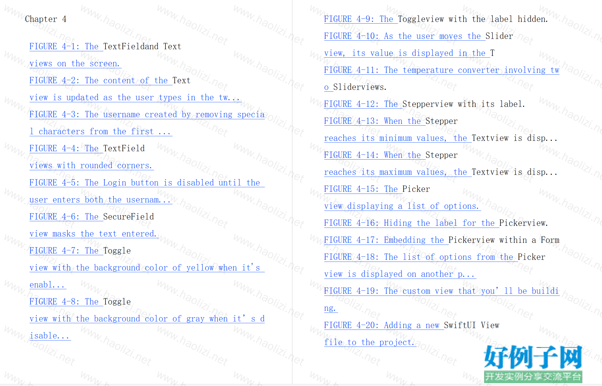
Chapter 4
FIGURE 4-1: The TextFieldand Textviews on the screen.
FIGURE 4-2: The content of the Textview is updated as the user types in the tw...
FIGURE 4-3: The username created by removing special characters from the first ...
FIGURE 4-4: The TextFieldviews with rounded corners.
FIGURE 4-5: The Login button is disabled until the user enters both the usernam...
FIGURE 4-6: The SecureFieldview masks the text entered.
FIGURE 4-7: The Toggleview with the background color of yellow when it's enabl...
FIGURE 4-8: The Toggleview with the background color of gray when it’s disable...
FIGURE 4-9: The Toggleview with the label hidden.
FIGURE 4-10: As the user moves the Sliderview, its value is displayed in the T
FIGURE 4-11: The temperature converter involving two Sliderviews.
FIGURE 4-12: The Stepperview with its label.
FIGURE 4-13: When the Stepperreaches its minimum values, the Textview is disp...
FIGURE 4-14: When the Stepperreaches its maximum values, the Textview is disp...
FIGURE 4-15: The Pickerview displaying a list of options.
FIGURE 4-16: Hiding the label for the Pickerview.
FIGURE 4-17: Embedding the Pickerview within a Form
FIGURE 4-18: The list of options from the Pickerview is displayed on another p...
FIGURE 4-19: The custom view that you’ll be building.
FIGURE 4-20: Adding a new SwiftUI Viewfile to the project.
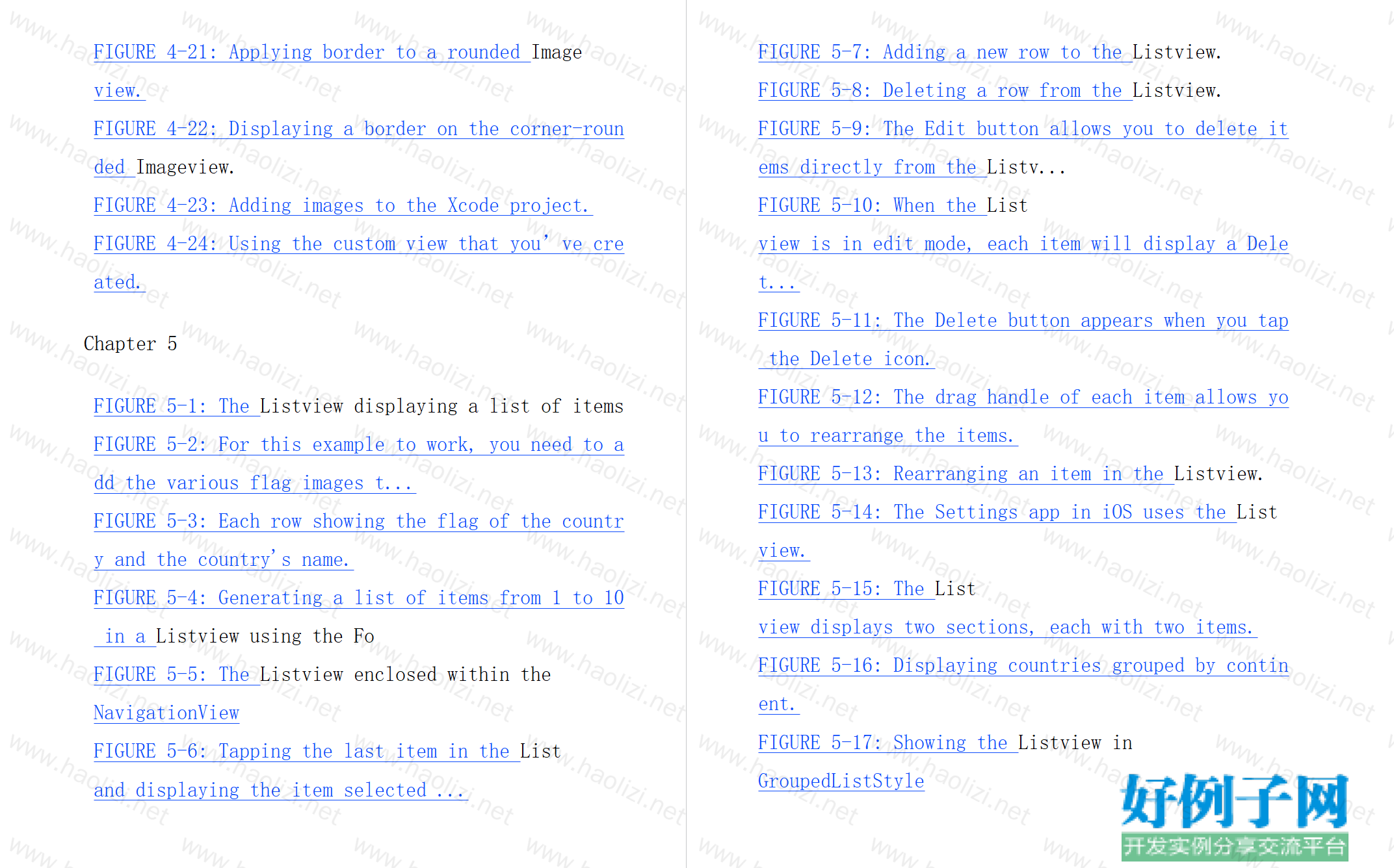
FIGURE 4-21: Applying border to a rounded Imageview.
FIGURE 4-22: Displaying a border on the corner-rounded Imageview.
FIGURE 4-23: Adding images to the Xcode project.
FIGURE 4-24: Using the custom view that you’ve created.
Chapter 5
FIGURE 5-1: The Listview displaying a list of items
FIGURE 5-2: For this example to work, you need to add the various flag images t...
FIGURE 5-3: Each row showing the flag of the country and the country's name.
FIGURE 5-4: Generating a list of items from 1 to 10 in a Listview using the Fo
FIGURE 5-5: The Listview enclosed within the NavigationView
FIGURE 5-6: Tapping the last item in the Listand displaying the item selected ...
FIGURE 5-7: Adding a new row to the Listview.
FIGURE 5-8: Deleting a row from the Listview.
FIGURE 5-9: The Edit button allows you to delete items directly from the Listv...
FIGURE 5-10: When the Listview is in edit mode, each item will display a Delet...
FIGURE 5-11: The Delete button appears when you tap the Delete icon.
FIGURE 5-12: The drag handle of each item allows you to rearrange the items.
FIGURE 5-13: Rearranging an item in the Listview.
FIGURE 5-14: The Settings app in iOS uses the Listview.
FIGURE 5-15: The Listview displays two sections, each with two items.
FIGURE 5-16: Displaying countries grouped by continent.
FIGURE 5-17: Showing the Listview in GroupedListStyle
FIGURE 5-18: Sections are displayed without any headers.
FIGURE 5-19: The Environment Overrides section on Xcode allows you to switch be...
FIGURE 5-20: The Listview displayed in Dark mode.
FIGURE 5-21: Viewing the preview in both Light and Dark modes.
Chapter 6
FIGURE 6-1: The flow of a navigation-style app.
FIGURE 6-2: The flow of a tabbed app.
FIGURE 6-3: A Textview wrapped within a NavigationView
FIGURE 6-4: Displaying the navigation bar title.
FIGURE 6-5: Displaying the navigation bar title in inlinedisplay mode.
FIGURE 6-6: Clicking the This Is a Text View link navigates to another screen (...
FIGURE 6-7: The back button to return to the previous screen
FIGURE 6-8: You can now navigate between the screens using the Next and Back bu...
FIGURE 6-9: The structure of the JSON content displayed using www.jsonlint.com
FIGURE 6-10: Displaying the news headlines using the Listview.
FIGURE 6-11: Adding a package to your XCode project
FIGURE 6-12: Displaying an image next to each news headline.
FIGURE 6-13: Displaying the navigation bar title.
FIGURE 6-14: Reducing the font size of the navigation bar title.
FIGURE 6-15: Previewing the details page.
FIGURE 6-16: Tapping a news item displays the news in more detail.
FIGURE 6-17: The details page with an empty space below the navigation bar.
FIGURE 6-18: The empty space below the navigation bar is gone.
FIGURE 6-19: Displaying a TabViewwith two screens.
FIGURE 6-20: Programmatically displaying the TabView2
Chapter 7
FIGURE 7-1: The rectangle is displayed in the center of the screen.
FIGURE 7-2: Showing the rectangle with a border.
FIGURE 7-3: The VStackview now contains two rectangles.
FIGURE 7-4: Aligning both rectangles to the right.
FIGURE 7-5: The VStackviews now occupy the entire screen.
FIGURE 7-6: Aligning the content of the VStackusing the leading and trailing o...
FIGURE 7-7: Aligning the content of the VStackusing the topLeadingand bottomT
FIGURE 7-8: Applying padding to the first rectangle
FIGURE 7-9: Applying padding with the various specified options.
FIGURE 7-10: The order of applying the modifiers matter.
FIGURE 7-11: Applying a Spacerview between the two rectangles.
FIGURE 7-12: The Spacerview expanding to fill up the space between the two rec...
FIGURE 7-13: The Spacerview automatically adjusts its height based on the scre...
FIGURE 7-14: Specifying the maxHeightand minHeightfor the Spacer view.
FIGURE 7-15: Using the HStackview to contain the two rectangles.
FIGURE 7-16: Using the Spacerview in the HStackview.
FIGURE 7-17: Aligning the first rectangle to the bottom of the HStackview.
FIGURE 7-18: The three Textviews are centered vertically within the HStackvie...
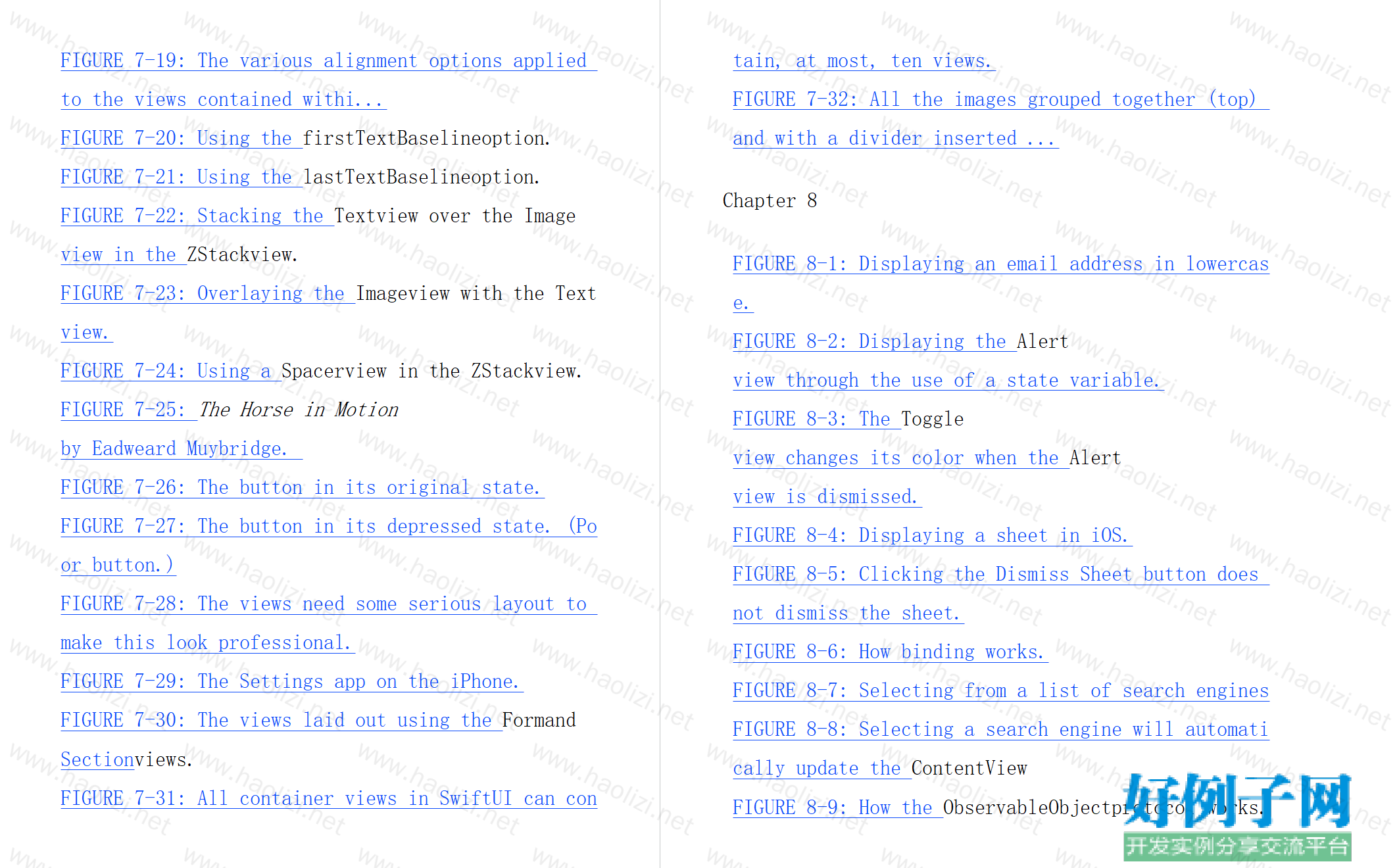
FIGURE 7-19: The various alignment options applied to the views contained withi...
FIGURE 7-20: Using the firstTextBaselineoption.
FIGURE 7-21: Using the lastTextBaselineoption.
FIGURE 7-22: Stacking the Textview over the Imageview in the ZStackview.
FIGURE 7-23: Overlaying the Imageview with the Textview.
FIGURE 7-24: Using a Spacerview in the ZStackview.
FIGURE 7-25: The Horse in Motionby Eadweard Muybridge.
FIGURE 7-26: The button in its original state.
FIGURE 7-27: The button in its depressed state. (Poor button.)
FIGURE 7-28: The views need some serious layout to make this look professional.
FIGURE 7-29: The Settings app on the iPhone.
FIGURE 7-30: The views laid out using the Formand Sectionviews.
FIGURE 7-31: All container views in SwiftUI can contain, at most, ten views.
FIGURE 7-32: All the images grouped together (top) and with a divider inserted ...
Chapter 8
FIGURE 8-1: Displaying an email address in lowercase.
FIGURE 8-2: Displaying the Alertview through the use of a state variable.
FIGURE 8-3: The Toggleview changes its color when the Alertview is dismissed.
FIGURE 8-4: Displaying a sheet in iOS.
FIGURE 8-5: Clicking the Dismiss Sheet button does not dismiss the sheet.
FIGURE 8-6: How binding works.
FIGURE 8-7: Selecting from a list of search engines
FIGURE 8-8: Selecting a search engine will automatically update the ContentView
FIGURE 8-9: How the ObservableObjectprotocol works.
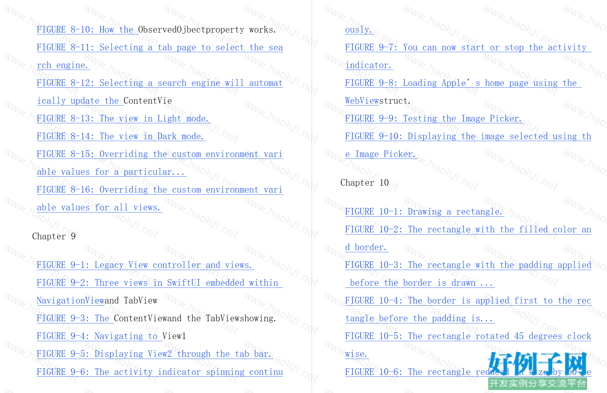
FIGURE 8-10: How the ObservedOjbectproperty works.
FIGURE 8-11: Selecting a tab page to select the search engine.
FIGURE 8-12: Selecting a search engine will automatically update the ContentVie
FIGURE 8-13: The view in Light mode.
FIGURE 8-14: The view in Dark mode.
FIGURE 8-15: Overriding the custom environment variable values for a particular...
FIGURE 8-16: Overriding the custom environment variable values for all views.
Chapter 9
FIGURE 9-1: Legacy View controller and views.
FIGURE 9-2: Three views in SwiftUI embedded within NavigationViewand TabView
FIGURE 9-3: The ContentViewand the TabViewshowing.
FIGURE 9-4: Navigating to View1
FIGURE 9-5: Displaying View2 through the tab bar.
FIGURE 9-6: The activity indicator spinning continuously.
FIGURE 9-7: You can now start or stop the activity indicator.
FIGURE 9-8: Loading Apple’s home page using the WebViewstruct.
FIGURE 9-9: Testing the Image Picker.
FIGURE 9-10: Displaying the image selected using the Image Picker.
Chapter 10
FIGURE 10-1: Drawing a rectangle.
FIGURE 10-2: The rectangle with the filled color and border.
FIGURE 10-3: The rectangle with the padding applied before the border is drawn ...
FIGURE 10-4: The border is applied first to the rectangle before the padding is...
FIGURE 10-5: The rectangle rotated 45 degrees clockwise.
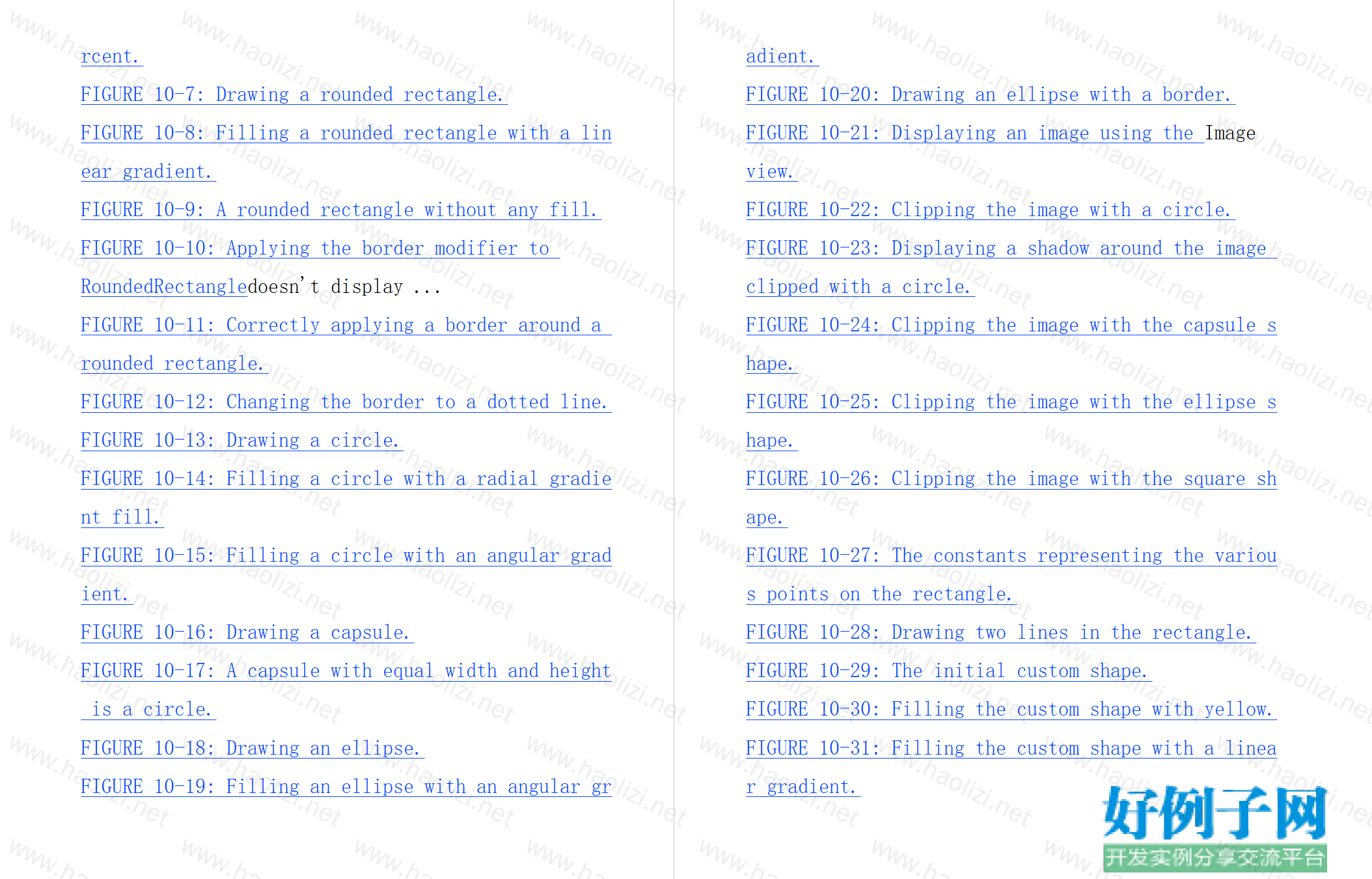
FIGURE 10-6: The rectangle reduced in size by 50 percent.
FIGURE 10-7: Drawing a rounded rectangle.
FIGURE 10-8: Filling a rounded rectangle with a linear gradient.
FIGURE 10-9: A rounded rectangle without any fill.
FIGURE 10-10: Applying the border modifier to RoundedRectangledoesn't display ...
FIGURE 10-11: Correctly applying a border around a rounded rectangle.
FIGURE 10-12: Changing the border to a dotted line.
FIGURE 10-13: Drawing a circle.
FIGURE 10-14: Filling a circle with a radial gradient fill.
FIGURE 10-15: Filling a circle with an angular gradient.
FIGURE 10-16: Drawing a capsule.
FIGURE 10-17: A capsule with equal width and height is a circle.
FIGURE 10-18: Drawing an ellipse.
FIGURE 10-19: Filling an ellipse with an angular gradient.
FIGURE 10-20: Drawing an ellipse with a border.
FIGURE 10-21: Displaying an image using the Imageview.
FIGURE 10-22: Clipping the image with a circle.
FIGURE 10-23: Displaying a shadow around the image clipped with a circle.
FIGURE 10-24: Clipping the image with the capsule shape.
FIGURE 10-25: Clipping the image with the ellipse shape.
FIGURE 10-26: Clipping the image with the square shape.
FIGURE 10-27: The constants representing the various points on the rectangle.
FIGURE 10-28: Drawing two lines in the rectangle.
FIGURE 10-29: The initial custom shape.
FIGURE 10-30: Filling the custom shape with yellow.
FIGURE 10-31: Filling the custom shape with a linear gradient.
FIGURE 10-32: Drawing the outline of the custom shape reveals the missing line.
FIGURE 10-33: The custom shape with the line added.
FIGURE 10-34: The custom shape after adding the arc
FIGURE 10-35: Understanding how the addArc()modifier works.
FIGURE 10-36: SwiftUI automatically draws a line connecting the last drawn poin...
FIGURE 10-37: How the custom shape will look after adding the last line.
FIGURE 10-38: Filling the custom shape and drawing borders around it at the sam...
FIGURE 10-39: Applying the multiplyblend mode to the Imageview.
FIGURE 10-40: Applying the different blend modes to the Imageview.
FIGURE 10-41: Three circles overlapping each other.
FIGURE 10-42: Applying the screenblend mode to all three circles.
FIGURE 10-43: Applying the blur effects on the three circles.
FIGURE 10-44: Applying the saturation effects to the three circles.
Chapter 11
FIGURE 11-1: Displaying the rounded Buttonview.
FIGURE 11-2: Zooming the Buttonview two and a half times.
FIGURE 11-3: Animating the changing of the scale of the button.
FIGURE 11-4: Dimming the Buttonview.
FIGURE 11-5: Spinning the wheel of fortune.
FIGURE 11-6: Displaying a Textview.
FIGURE 11-7: Applying the 3D rotation to the x-axis (45 degrees).
FIGURE 11-8: Applying the 3D rotation to the x-axis (75 degrees).
FIGURE 11-9: Applying the 3D rotation to the y-axis.
FIGURE 11-10: Applying the 3D rotation to the z-axis.
FIGURE 11-11: Applying the 3D rotation to the three axes.
FIGURE 11-12: Applying the 3D rotation to a view on the three axes.
FIGURE 11-13: The indeterminate progress indicator that you’ll build.
FIGURE 11-14: The layout of the two circles, and rotating the starting point 90...
FIGURE 11-15: The trim controls the proportion of the circle to display, as wel...
FIGURE 11-16: Using the indeterminate progress indicator.
FIGURE 11-17: Using the determinate progress indicator.
Chapter 12
FIGURE 12-1: The app you build in this chapter.
FIGURE 12-2: Selecting from a list of news sources.
FIGURE 12-3: Creating a single-view app in Xcode.
FIGURE 12-4: Adding three SwiftUI View items and one Swift File item to your pr...
FIGURE 12-5: The application with two tab items.
FIGURE 12-6: Adding the NewsURL.swiftfile to your project.
FIGURE 12-7: Displaying the news headlines.
FIGURE 12-8: Displaying an image for each news headline.
FIGURE 12-9: Displaying the details of the news item.
FIGURE 12-10: Displaying the share sheet.
FIGURE 12-11: Displaying the preferences view.
FIGURE 12-12: The preferences view with the selected news source.
FIGURE 12-13: Select a new news source and the Listview will automatically dis...
FIGURE 12-14: Preparing to deploy your app to a real device.
FIGURE 12-15: Entering your Apple ID.
FIGURE 12-16: Selecting your Apple ID.
FIGURE 12-17: Be sure to select your device name before proceeding with deploym...
FIGURE 12-18: Your app needs to be trusted before it can run.
FIGURE 12-19: Trusting the app.
Chapter 13
FIGURE 13-1: Setting up localization for your project in Xcode.
FIGURE 13-2: Adding a strings file item to your project.
FIGURE 13-3: Viewing the File Inspector window for the Localizable.stringsfile...
FIGURE 13-4: The new language should now appear under the Localization section.
FIGURE 13-5: The two string files for the two languages, English and Simplified...
FIGURE 13-6: Displaying the Text view in Simplified Chinese.
FIGURE 13-7: Concatenating different Textviews together.
FIGURE 13-8: Enabling the Debug Preview feature in the preview canvas.
FIGURE 13-9: The target set for your project (iPhone 11 Pro Max, in this exampl...
FIGURE 13-10: Previewing your app in the specified dimensions.
FIGURE 13-11: Previewing the app on an iPhone 11 and an iPhone SE.
FIGURE 13-12: Previewing in Dark mode but the background of the app is still wh...
FIGURE 13-13: You can now preview the Dark mode correctly.
FIGURE 13-14: Extracting views as subviews in the preview canvas.
FIGURE 13-15: Naming the newly extracted subview.
FIGURE 13-16: Implementing a context menu on an Imageview
相关软件
小贴士
感谢您为本站写下的评论,您的评论对其它用户来说具有重要的参考价值,所以请认真填写。
- 类似“顶”、“沙发”之类没有营养的文字,对勤劳贡献的楼主来说是令人沮丧的反馈信息。
- 相信您也不想看到一排文字/表情墙,所以请不要反馈意义不大的重复字符,也请尽量不要纯表情的回复。
- 提问之前请再仔细看一遍楼主的说明,或许是您遗漏了。
- 请勿到处挖坑绊人、招贴广告。既占空间让人厌烦,又没人会搭理,于人于己都无利。
关于好例子网
本站旨在为广大IT学习爱好者提供一个非营利性互相学习交流分享平台。本站所有资源都可以被免费获取学习研究。本站资源来自网友分享,对搜索内容的合法性不具有预见性、识别性、控制性,仅供学习研究,请务必在下载后24小时内给予删除,不得用于其他任何用途,否则后果自负。基于互联网的特殊性,平台无法对用户传输的作品、信息、内容的权属或合法性、安全性、合规性、真实性、科学性、完整权、有效性等进行实质审查;无论平台是否已进行审查,用户均应自行承担因其传输的作品、信息、内容而可能或已经产生的侵权或权属纠纷等法律责任。本站所有资源不代表本站的观点或立场,基于网友分享,根据中国法律《信息网络传播权保护条例》第二十二与二十三条之规定,若资源存在侵权或相关问题请联系本站客服人员,点此联系我们。关于更多版权及免责申明参见 版权及免责申明


网友评论
我要评论