
实例介绍
【实例简介】
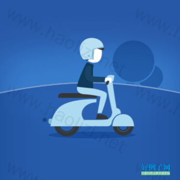
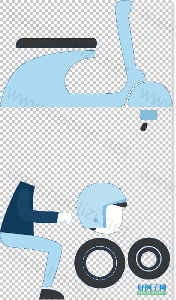
CSS3实现骑摩托车兜风动画特效
【实例截图】
【核心代码】
====================HTML==================
<div class="con_wrap con_wrap_4 wrap_show">
<div class="motor_hook">
<div class="motor_wrap">
<div class="man">
<div class="head"></div>
<div class="body"></div>
</div>
<div class="motor">
<div class="wheel_front"></div>
<div class="wheel_back"></div>
<div class="motor_body"></div>
<div class="motor_handle"></div>
<div class="motor_pipe">
<i class="pipe"></i>
<i class="smoke smoke_1"></i>
<i class="smoke smoke_2"></i>
</div>
</div>
</div>
<div class="motor_shadow"></div>
</div>
<div class="tree_wrap">
<span class="tree_1"><i></i></span>
<span class="tree_2"><i></i></span>
</div>
<div class="wording_wrap">
<div class="wording wording_4"></div>
</div>
<div class="earth_bg"></div>
</div>
===================主要CSS=============
@charset "utf-8";
@-webkit-keyframes a_building{
0%{-webkit-transform:translate(0px,100px) scale(0.1,0.1);opacity:0;}
70%{-webkit-transform:translate(0px,0px) scale(1.1,1.1);opacity:1;}
80%{-webkit-transform:translate(0px,0px) scale(0.9,0.9);opacity:1;}
90%{-webkit-transform:translate(0px,0px) scale(1.05,1.05);opacity:1;}
100%{-webkit-transform:translate(0px,0px) scale(1,1);opacity:1;}
}
/*介绍页 3*/
.wording_wrap .wording_4{display:block;height:70px;width:138px;background: url(../images/page_3/page_3_man.png) no-repeat 0 -109px;background-size:172px 300px;position:absolute;left:50%;margin-left:-69px;bottom:80px;opacity:0;}
.tree_wrap{display:block;width:100%;}
.tree_wrap .tree_1{display:block;height:150px;width:112px;position:absolute;left:50%;margin-left:-157px;bottom:240px;z-index:1;-webkit-transform-origin:50% 100%;opacity:0.8;}
.tree_wrap .tree_2{display:block;height:160px;width:149px;position:absolute;left:50%;margin-left:28px;bottom:245px;z-index:1;-webkit-transform-origin:50% 100%;opacity:0.8;}
.tree_wrap .tree_1 i{display:block;height:150px;width:112px;background:url(../images/page_3/sprite_scene.png) no-repeat 0 0; background-size:250px 160px;position:absolute;left:0;bottom:0;z-index:1;-webkit-transform-origin:50% 100%;opacity:1;}
.tree_wrap .tree_2 i{display:block;height:160px;width:149px;background:url(../images/page_3/sprite_scene.png) no-repeat -114px 0; background-size:250px 160px;position:absolute;left:0;bottom:0;z-index:1;-webkit-transform-origin:50% 100%;opacity:1;}
.motor_hook{display:block;height:107px;width:187px;position:absolute;bottom:221px;left:50%;margin-left:-96px;z-index:3;}
.motor_wrap{display:block;height:107px;width:187px;position:absolute;top:0px;left:0;-webkit-transform-origin:50% 700%;-webkit-transform:rotate(-32deg);z-index:1;opacity:0;}
.motor_wrap .man{display:block;height:118px;width:72px;position:absolute;left:67px;top:-26px;z-index:2;-webkit-transform-origin:50% 100%;}
.motor_wrap .man .body{display:block;height:118px;width:72px;background: url(../images/page_3/page_3_man.png) no-repeat 0 -181px;background-size:172px 300px;position:absolute;left:0;bottom:0;}
.motor_wrap .man .head{display:block;height:54px;width:55px;background: url(../images/page_3/page_3_man.png) no-repeat -74px -181px;background-size:172px 300px;position:absolute;left:2px;top:-52px;-webkit-transform-origin:50% 100%;}
.motor_wrap .motor .motor_body{display:block;height:107px;width:172px;background: url(../images/page_3/page_3_man.png) no-repeat 0 0;background-size:172px 300px;position:absolute;left:12px;top:0px;z-index:1;}
.motor_wrap .motor .motor_handle{display:block;height:9px;width:7px;background: url(../images/page_3/page_3_man.png) no-repeat -140px -122px;background-size:172px 300px;position:absolute;right:54px;top:12px;z-index:3;}
.motor_wrap .motor .motor_pipe{display:block;height:11px;width:17px;background: url(../images/page_3/page_3_man.png) no-repeat -140px -109px;background-size:172px 300px;position:absolute;left:8px;top:91px;}
.motor_wrap .motor .pipe{display:block;height:11px;width:17px;background: url(../images/page_3/page_3_man.png) no-repeat -140px -109px;background-size:172px 300px;position:absolute;left:0;top:0;z-index:2;}
.motor_wrap .motor .wheel_front{display:block;height:42px;width:42px;background: url(../images/page_3/page_3_man.png) no-repeat -127px -237px;background-size:172px 300px;position:absolute;right:4px;top:84px;-webkit-transform-origin:50% 100%;}
.motor_wrap .motor .wheel_back{display:block;height:51px;width:51px;background: url(../images/page_3/page_3_man.png) no-repeat -74px -237px;background-size:172px 300px;position:absolute;left:20px;bottom:-21px;-webkit-transform-origin:50% 100%;}
.motor_wrap .motor .smoke{display:block;height:10px;width:10px;background:#18437a;border-radius:10px;position:absolute;left:0px;top:3px;}
.motor_wrap .penguin{display:block;height:48px;width:40px;background: url(../images/page_3/page_3_man.png) no-repeat -131px -181px;background-size:172px 300px;position:absolute;left:27px;top:-6px;-webkit-transform-origin:50% 100%;}
.motor_shadow{display:block;height:14px;width:180px;position:absolute;left:50%;margin-left:-85px;bottom:-25px;background:#194d9c;border-radius:180px/14px;-webkit-transform-origin:50% 600px;-webkit-transform:rotate(-35deg);opacity:0;}
.wrap_show .tree_wrap .tree_1 i{-webkit-animation:a_building 0.3s 0.3s linear both;}
.wrap_show .tree_wrap .tree_2 i{-webkit-animation:a_building 0.3s 0.5s linear both;}
.wrap_show .tree_wrap .tree_1{-webkit-animation:a_tree_move_1 3s 1s linear infinite;}
.wrap_show .tree_wrap .tree_2{-webkit-animation:a_tree_move_2 3s 1.1s linear infinite;}
@-webkit-keyframes a_tree_move_1{
0%{-webkit-transform:translate(0,0) rotate(0);opacity:0.8;}
33%{-webkit-transform:translate(-160%,50px) rotate(-10deg);opacity:0.8;}
34%{-webkit-transform:translate(-160%,0) rotate(0);opacity:0;}
35%{-webkit-transform:translate(-160%,-100%) rotate(0);opacity:0;}
36%{-webkit-transform:translate(300%,-100%) rotate(0);opacity:0;}
37%{-webkit-transform:translate(300%,0) rotate(0deg);opacity:0;}
38%{-webkit-transform:translate(290%,0px) rotate(25deg);opacity:0.8;}
70%{-webkit-transform:translate(150%,-10px) rotate(12deg);opacity:0.8;}
100%{-webkit-transform:translate(0,0) rotate(0);opacity:0.8;}
}
@-webkit-keyframes a_tree_move_2{
0%{-webkit-transform:translate(0,0) rotate(0);opacity:0.8;}
22%{-webkit-transform:translate(-83%,-15px) rotate(-17deg);opacity:0.8;}
66%{-webkit-transform:translate(-250%,10px) rotate(-35deg);opacity:0.8;}
67%{-webkit-transform:translate(-250%,0) rotate(0);opacity:0;}
68%{-webkit-transform:translate(-250%,-100%) rotate(0);opacity:0;}
69%{-webkit-transform:translate(100%,-100%) rotate(0);opacity:0;}
70%{-webkit-transform:translate(100%,0) rotate(0);opacity:0.8;}
85%{-webkit-transform:translate(50%,5px) rotate(10deg);opacity:0.8;}
100%{-webkit-transform:translate(0,0) rotate(0);opacity:0.8;}
}
.wrap_show .motor_hook{-webkit-animation:a_motor_hook 1s 2.4s linear infinite alternate;}
.wrap_show .motor_wrap{-webkit-animation:a_motor_wrap 1.5s 0.9s linear both;}
.wrap_show .motor_shadow{-webkit-animation:a_motor_wrap 1.5s 0.9s linear both;}
.wrap_show .motor_wrap .motor .motor_handle{-webkit-animation:a_motor_handle 0.5s linear infinite;}
.wrap_show .motor_wrap .motor .motor_body{-webkit-animation:a_motor_body 0.5s linear infinite;}
.wrap_show .motor_wrap .motor .wheel_front{-webkit-animation:a_wheel_front 0.5s linear infinite;}
.wrap_show .motor_wrap .motor .wheel_back{-webkit-animation:a_wheel_front 0.5s linear infinite;}
.wrap_show .motor_wrap .motor .motor_pipe{-webkit-animation:a_wheel_front 0.5s 0.1s linear infinite;}
.wrap_show .motor_wrap .motor .smoke_1{-webkit-animation:a_smoke 1s 0.1s linear infinite;}
.wrap_show .motor_wrap .motor .smoke_2{-webkit-animation:a_smoke 1s 0.5s linear infinite;}
.wrap_show .motor_wrap .penguin{-webkit-animation:a_motor_penguin 0.5s linear infinite;}
.wrap_show .motor_wrap .penguin .scarf{-webkit-animation:a_motor_penguin_scarf 0.3s linear infinite;}
.wrap_show .motor_wrap .man{-webkit-animation:a_motor_man 0.5s linear infinite;}
.wrap_show .motor_wrap .man .body .tie{-webkit-animation:a_motor_penguin_scarf 0.4s 0.2s linear infinite;}
.wrap_show .motor_wrap .man .head{-webkit-animation:a_motor_man_head 0.5s linear infinite;}
@-webkit-keyframes a_motor_hook{
0%{-webkit-transform: translate(0,0);}
25%{-webkit-transform: translate(-2px,0);}
50%{-webkit-transform: translate(4px,0);}
75%{-webkit-transform: translate(-1px,0);}
100%{-webkit-transform: translate(0,0);}
}
@-webkit-keyframes a_motor_wrap{
0%{-webkit-transform:rotate(-35deg);opacity:0;}
5%{-webkit-transform:rotate(-35deg);opacity:1;}
100%{-webkit-transform:rotate(0deg);opacity:1;}
}
@-webkit-keyframes a_motor_handle{
0%{-webkit-transform:translate(0,0);}
25%{-webkit-transform:translate(1px,1px);}
50%{-webkit-transform:translate(-2px,-4px);}
75%{-webkit-transform:translate(1px,0px);}
100%{-webkit-transform:translate(0,0);}
}
@-webkit-keyframes a_wheel_front{
0%{-webkit-transform:translate(0,0) scale(1,1);}
25%{-webkit-transform:translate(1px,1px) scale(1.07,0.98);}
50%{-webkit-transform:translate(-1px,-1px) scale(0.96,1.06);}
75%{-webkit-transform:translate(1px,0px) scale(1.05,0.99);}
100%{-webkit-transform:translate(0,0) scale(1,1);}
}
@-webkit-keyframes a_smoke{
0%{-webkit-transform:translate(0,0) scale(0.5,0.5);opacity:0;}
25%{-webkit-transform:translate(-6px,0px) scale(0.8,0.6);opacity:1;}
50%{-webkit-transform:translate(-12px,-4px) scale(0.9,0.8);opacity:1;}
75%{-webkit-transform:translate(-18px,-12px) scale(1,1);opacity:0.5;}
100%{-webkit-transform:translate(-12px,-16px) scale(1.05,1.05);opacity:0;}
}
@-webkit-keyframes a_motor_body{
0%{-webkit-transform:translate(0,0) scale(1,1);}
25%{-webkit-transform:translate(1px,1px) scale(1.02,0.99);}
50%{-webkit-transform:translate(-1px,-3px) scale(0.97,1.03);}
75%{-webkit-transform:translate(1px,0px) scale(1.01,1);}
100%{-webkit-transform:translate(0,0) scale(1,1);}
}
@-webkit-keyframes a_motor_penguin{
0%{-webkit-transform:translate(0,0) scale(1,1);}
25%{-webkit-transform:translate(1px,1px) scale(1.05,0.98);}
50%{-webkit-transform:translate(-1px,-4px) scale(0.96,1.07);}
75%{-webkit-transform:translate(1px,0px) scale(1.03,0.99);}
100%{-webkit-transform:translate(0,0) scale(1,1);}
}
@-webkit-keyframes a_motor_man{
0%{-webkit-transform:translate(0,0) scale(1,1);}
25%{-webkit-transform:translate(0px,1px) scale(1.02,0.99);}
50%{-webkit-transform:translate(0px,-3px) scale(0.97,1.03);}
75%{-webkit-transform:translate(0px,0px) scale(1.01,1);}
100%{-webkit-transform:translate(0,0) scale(1,1);}
}
@-webkit-keyframes a_motor_man_head{
0%{-webkit-transform: rotate(0deg);}
25%{-webkit-transform: rotate(8deg);}
50%{-webkit-transform: rotate(-6deg);}
75%{-webkit-transform: rotate(4deg);}
100%{-webkit-transform: rotate(0deg);}
}
/*介绍页 3*/
/*ip 4s*/
@media all and (min-width:320px) and (max-height:416px){
body{background:#2758a7;}
.con_wrap{top:40px;}
}
小贴士
感谢您为本站写下的评论,您的评论对其它用户来说具有重要的参考价值,所以请认真填写。
- 类似“顶”、“沙发”之类没有营养的文字,对勤劳贡献的楼主来说是令人沮丧的反馈信息。
- 相信您也不想看到一排文字/表情墙,所以请不要反馈意义不大的重复字符,也请尽量不要纯表情的回复。
- 提问之前请再仔细看一遍楼主的说明,或许是您遗漏了。
- 请勿到处挖坑绊人、招贴广告。既占空间让人厌烦,又没人会搭理,于人于己都无利。
关于好例子网
本站旨在为广大IT学习爱好者提供一个非营利性互相学习交流分享平台。本站所有资源都可以被免费获取学习研究。本站资源来自网友分享,对搜索内容的合法性不具有预见性、识别性、控制性,仅供学习研究,请务必在下载后24小时内给予删除,不得用于其他任何用途,否则后果自负。基于互联网的特殊性,平台无法对用户传输的作品、信息、内容的权属或合法性、安全性、合规性、真实性、科学性、完整权、有效性等进行实质审查;无论平台是否已进行审查,用户均应自行承担因其传输的作品、信息、内容而可能或已经产生的侵权或权属纠纷等法律责任。本站所有资源不代表本站的观点或立场,基于网友分享,根据中国法律《信息网络传播权保护条例》第二十二与二十三条之规定,若资源存在侵权或相关问题请联系本站客服人员,点此联系我们。关于更多版权及免责申明参见 版权及免责申明
网友评论
我要评论