

实例介绍
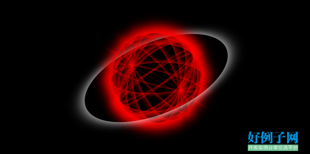
【实例简介】纯css实现动态球体转动
【实例截图】
动态效果:
【核心代码】
<!DOCTYPE html>
<html>
<head>
<meta charset="UTF-8">
<title></title>
<style type="text/css">
*{
margin: 0px;
padding: 0px;
list-style: none;
}
html,body{
width: 100%;
height: 100%;
}
#box{
width: 100%;
height: 100%;
background-color: black;
}
#box01{
width: 500px;
height: 500px;
position: absolute;
left: 50%;
margin-left: -250px;
top: 50%;
margin-top: -250px;
border-radius: 100%;
box-shadow: 0 0 50px white;
transform-style: preserve-3d;
transform: rotateX(60deg) rotateY(-20deg);
animation: anim1 10s infinite linear;
}
#box01 ul{
width: 300px;
height: 300px;
position: absolute;
left: 50%;
margin-left: -150px;
top: 50%;
margin-top: -150px;
transform-style: preserve-3d;
}
#box01 ul li{
width: 100%;
height: 100%;
border: 1px solid red;
position: absolute;
left: 0px;
top: 0px;
transform-style: preserve-3d;
border-radius:100% ;
box-shadow: 0px 0px 50px red;
}
/**
* 寻找id为box01里的ul标签中的li标签
* nth-child(1):第一个
*/
#box01 ul li:nth-child(1){
transform: rotateY(20deg);
}
#box01 ul li:nth-child(2){
transform: rotateY(40deg);
}
#box01 ul li:nth-child(3){
transform: rotateY(60deg);
}
#box01 ul li:nth-child(4){
transform: rotateY(80deg);
}
#box01 ul li:nth-child(5){
transform: rotateY(100deg);
}
#box01 ul li:nth-child(6){
transform: rotateY(120deg);
}
#box01 ul li:nth-child(7){
transform: rotateY(140deg);
}
#box01 ul li:nth-child(8){
transform: rotateY(160deg);
}
#box01 ul li:nth-child(9){
transform: rotateX(20deg);
}
#box01 ul li:nth-child(10){
transform: rotateX(40deg);
}
#box01 ul li:nth-child(11){
transform: rotateX(60deg);
}
#box01 ul li:nth-child(12){
transform: rotateX(80deg);
}
#box01 ul li:nth-child(13){
transform: rotateX(100deg);
}
#box01 ul li:nth-child(14){
transform: rotateX(120deg);
}
#box01 ul li:nth-child(15){
transform: rotateX(140deg);
}
#box01 ul li:nth-child(16){
transform: rotateX(160deg);
}
@keyframes anim1{
0%{
transform: rotateX(60deg) rotateY(-20deg) rotateZ(0deg);
}
100%{
transform: rotateX(60deg) rotateY(-20deg) rotateZ(360deg);
}
}
</style>
</head>
<body>
<div id="box">
<div id="box01">
<ul id="ul01">
<li></li>
<li></li>
<li></li>
<li></li>
<li></li>
<li></li>
<li></li>
<li></li>
<li></li>
<li></li>
<li></li>
<li></li>
<li></li>
<li></li>
<li></li>
<li></li>
</ul>
</div>

</div>
</body>
</html>
好例子网口号:伸出你的我的手 — 分享!
小贴士
感谢您为本站写下的评论,您的评论对其它用户来说具有重要的参考价值,所以请认真填写。
- 类似“顶”、“沙发”之类没有营养的文字,对勤劳贡献的楼主来说是令人沮丧的反馈信息。
- 相信您也不想看到一排文字/表情墙,所以请不要反馈意义不大的重复字符,也请尽量不要纯表情的回复。
- 提问之前请再仔细看一遍楼主的说明,或许是您遗漏了。
- 请勿到处挖坑绊人、招贴广告。既占空间让人厌烦,又没人会搭理,于人于己都无利。
关于好例子网
本站旨在为广大IT学习爱好者提供一个非营利性互相学习交流分享平台。本站所有资源都可以被免费获取学习研究。本站资源来自网友分享,对搜索内容的合法性不具有预见性、识别性、控制性,仅供学习研究,请务必在下载后24小时内给予删除,不得用于其他任何用途,否则后果自负。基于互联网的特殊性,平台无法对用户传输的作品、信息、内容的权属或合法性、安全性、合规性、真实性、科学性、完整权、有效性等进行实质审查;无论平台是否已进行审查,用户均应自行承担因其传输的作品、信息、内容而可能或已经产生的侵权或权属纠纷等法律责任。本站所有资源不代表本站的观点或立场,基于网友分享,根据中国法律《信息网络传播权保护条例》第二十二与二十三条之规定,若资源存在侵权或相关问题请联系本站客服人员,点此联系我们。关于更多版权及免责申明参见 版权及免责申明

网友评论
我要评论