
实例介绍
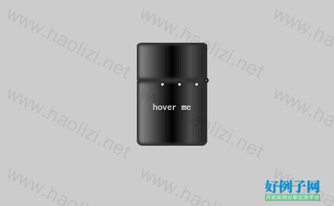
【实例简介】纯css3打火机动画,纯CSS3实现打火机火焰动画DEMO演示
【实例截图】
【核心代码】
<!DOCTYPE html>
<html>

<head>

  <meta charset="UTF-8">

  <title>纯CSS3实现打火机火焰动画DEMO演示</title>


    <style>
@charset "UTF-8";
body {
  background: #cccccc;
}

:before, :after {
  position: absolute;
  content: "";
}

.playground {
  position: relative;
  width: 140px;
  height: 400px;
  left: 50%;
  margin-left: -70px;
}

.flame {
  opacity: 0;
  position: absolute;
  bottom: 60%;
  left: 42%;
  width: 14px;
  height: 70px;
  background-color: white;
  border-radius: 100% 100% 0 0;
  box-shadow: 0 0 20px #FFFEF0, 0 0 20px #FFFEE6, 0 0 20px #fefcc9,  10px -10px 30px #feec85,  -20px -20px 40px #ffae34,  20px -40px 50px #ec760c,  -20px -60px 60px #cd4606,  0 -80px 70px #973716,  10px -90px 80px #451b0e;
  animation: flame 3s infinite linear;
}

.lighterBody {
  position: absolute;
  width: 140px;
  height: 130px;
  top: 200px;
  left: 0;
  background: linear-gradient(to right, #959595 0%, #0d0d0d 46%, #010101 50%, #0a0a0a 53%, #4e4e4e 76%, #383838 87%, #1b1b1b 100%);
  border-radius: 2% 2% 8% 8%;
  box-shadow: inset 0 0 5px 5px #333333;
}
.lighterBody:before {
  width: 47px;
  height: 47px;
  top: -50px;
  left: 42px;
  border-radius: 6% 6% 0 0;
  background: linear-gradient(to right, #f5f6f6 0%, #dbdce2 21%, #b8bac6 49%, #dddfe3 80%, #f5f6f6 100%);
  content: " • • • • • • • • •";
  color: #e6e6e6;
  font-size: 20px;
  letter-spacing: 2px;
  line-height: 16px;
  text-shadow: 0 0 5px black;
  padding-top: 3px;
  padding-left: 4px;
}
.lighterBody:after {
  width: 33px;
  height: 33px;
  background: radial-gradient(ellipse at center, #7d7e7d 0%, #0e0e0e 100%);
  border-radius: 100%;
  top: -33px;
  left: 6px;
  box-shadow: inset 0 0 1px 2px gray;
}

.playground:hover .flame {
  opacity: 1;
  transition: 0.4s linear;
}

.playground:hover .lid {
  animation: lidOff 0.3s linear;
  animation-fill-mode: forwards;
}

.hover {
  text-align: center;
  margin-top: 30%;
  font-family: 'Sonsie One', cursive;
  font-size: 19px;
  color: rgba(255, 255, 255, 0.9);
  text-shadow: 0 1px 1px rgba(0, 0, 0, 0.8);
}
.hover:before {
  z-index: 1;
  width: 0;
  height: 0;
  top: -50px;
  left: 20px;
  border-bottom: 35px solid #f2f2f2;
  border-left: 22px solid transparent;
}

.lid {
  z-index: 2;
  position: absolute;
  width: 140px;
  height: 75px;
  top: 125px;
  left: 0;
  background: linear-gradient(to right, #959595 0%, #0d0d0d 46%, #010101 50%, #0a0a0a 53%, #4e4e4e 76%, #383838 87%, #1b1b1b 100%);
  border-radius: 8% 8% 2% 2%;
  box-shadow: inset 0 0 5px 5px #333333;
}
.lid:before {
  width: 10px;
  height: 10px;
  top: 70px;
  left: 133px;
  background: radial-gradient(ellipse at center, #959595 0%, #0d0d0d 46%, #010101 50%, #0a0a0a 53%, #4e4e4e 76%, #383838 87%, #1b1b1b 100%);
  border-radius: 100%;
}

@keyframes flame {
  0% {
    height: 70px;
    transform: skewY(0deg);
    border-radius: 100% 100% 0 0;
  }

  25% {
    height: 60px;
    transform: skewY(40deg);
    border-radius: 10% 100% 0 0;
  }

  60% {
    height: 65px;
    transform: skewY(-20deg);
    border-radius: 90% 10% 0 0;
  }

  70% {
    height: 50px;
    transform: skewY(10deg);
    border-radius: 10% 100% 0 0;
  }

  100% {
    height: 70px;
    transform: skewY(0deg);
  }
}
@keyframes lidOff {
  from {
    transform: rotate(0deg);
    transform-origin: 100% 100%;
  }

  to {
    transform: rotate(130deg);
    transform-origin: 100% 100%;
  }
}

</style>

    <script src="js/prefixfree.min.js"></script>

</head>

<body>

  <div class='playground'>
  <div class='flame'></div>
  <div class='lighterBody'>
    <div class='hover'>
      hover me
    </div>
  </div>
  <div class='lid'></div>
</div>
<div style="text-align:center;clear:both;">
<script src="js/gg_bd_ad_720x90.js" type="text/javascript"></script>
<script src="js/follow.js" type="text/javascript"></script>
</div>
</body>

</html>
好例子网口号:伸出你的我的手 — 分享!
小贴士
感谢您为本站写下的评论,您的评论对其它用户来说具有重要的参考价值,所以请认真填写。
- 类似“顶”、“沙发”之类没有营养的文字,对勤劳贡献的楼主来说是令人沮丧的反馈信息。
- 相信您也不想看到一排文字/表情墙,所以请不要反馈意义不大的重复字符,也请尽量不要纯表情的回复。
- 提问之前请再仔细看一遍楼主的说明,或许是您遗漏了。
- 请勿到处挖坑绊人、招贴广告。既占空间让人厌烦,又没人会搭理,于人于己都无利。
关于好例子网
本站旨在为广大IT学习爱好者提供一个非营利性互相学习交流分享平台。本站所有资源都可以被免费获取学习研究。本站资源来自网友分享,对搜索内容的合法性不具有预见性、识别性、控制性,仅供学习研究,请务必在下载后24小时内给予删除,不得用于其他任何用途,否则后果自负。基于互联网的特殊性,平台无法对用户传输的作品、信息、内容的权属或合法性、安全性、合规性、真实性、科学性、完整权、有效性等进行实质审查;无论平台是否已进行审查,用户均应自行承担因其传输的作品、信息、内容而可能或已经产生的侵权或权属纠纷等法律责任。本站所有资源不代表本站的观点或立场,基于网友分享,根据中国法律《信息网络传播权保护条例》第二十二与二十三条之规定,若资源存在侵权或相关问题请联系本站客服人员,点此联系我们。关于更多版权及免责申明参见 版权及免责申明
网友评论
我要评论