
实例介绍
【实例简介】
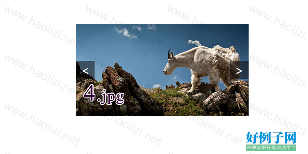
【实例截图】


【核心代码】
<!DOCTYPE html>
<html>
<head lang="en">
<meta charset="UTF-8">
<title>CSS3 3D切割轮播图</title>
<style>
body {
margin: 0;
padding: 0;
}
ul {
margin: 0;
padding: 0;
list-style: none;
height: 100%;
width: 100%;
}
.view {
width: 560px;
height: 300px;
border: 1px solid #ccc;
margin: 100px auto;
position: relative;
}
/*大盒子*/
.view ul {
width: 560px;
height: 300px;
/*3d呈现*/
transform-style: preserve-3d;
}
.view ul li {
width: 112px;
height: 300px;
float: left;
position: relative;
/*3d呈现*/
transform-style: preserve-3d;
}
.view ul li span {
position: absolute;
left: 0;
top: 0;
width: 100%;
height: 100%;
}
.view ul li span:nth-child(1) {
background-image: url("images/1.jpg");
background-repeat: no-repeat;
transform:translateZ(150px);
}
.view ul li span:nth-child(2) {
background-image: url("images/2.jpg");
background-repeat: no-repeat;
transform: translateY(-150px) rotateX(90deg);
}
.view ul li span:nth-child(3) {
background-image: url("images/3.jpg");
background-repeat: no-repeat;
transform: translateZ(-150px) rotateX(180deg);
}
.view ul li span:nth-child(4) {
background-image: url("images/4.jpg");
background-repeat: no-repeat;
transform: translateY(150px) rotateX(270deg);
}
.view ul li:nth-child(2) span {
background-position: -112px;
}
.view ul li:nth-child(3) span {
background-position: -224px;
}
.view ul li:nth-child(4) span {
background-position: -336px;
}
.view ul li:nth-child(5) span {
background-position: -448px;
}
/*3d转换 旋转*/
.view ul li {
transition: all 1s;
/*transform: translateZ(150px);*/
/*transform-origin: center center -150px;*/
}
/*按钮*/
.prev, .next {
display: block;
width: 60px;
height: 60px;
text-align: center;
line-height: 60px;
margin-top: -30px;
font-size: 40px;
color: #FFF;
text-decoration: none;
background-color: rgba(0, 0, 0, 0.5);
position: absolute;
top: 50%;
}
.next {
right: 0;
}
</style>
</head>
<body>
<div class="view">
<ul>
<li><span></span><span></span><span></span><span></span></li>
<li><span></span><span></span><span></span><span></span></li>
<li><span></span><span></span><span></span><span></span></li>
<li><span></span><span></span><span></span><span></span></li>
<li><span></span><span></span><span></span><span></span></li>
</ul>
<a href="javascript:;" class="prev"><</a>
<a href="javascript:;" class="next">></a>
</div>
<script src="js/jquery.min.js"></script>
<script>
$(function () {
var count = 0;
$('.prev').on('click', function () {
count ;
$('li').css('transform','rotateX(' count*90 'deg)').each(function(index){
$(this).css('transition-delay',index*0.25 's');
});
})
$('.next').on('click', function () {
count -- ;
$('li').css('transform','rotateX(' count*90 'deg)').each(function(index){
$(this).css('transition-delay',index*0.25 's');
});
})
});
</script>
</body>
</html>
好例子网口号:伸出你的我的手 — 分享!
小贴士
感谢您为本站写下的评论,您的评论对其它用户来说具有重要的参考价值,所以请认真填写。
- 类似“顶”、“沙发”之类没有营养的文字,对勤劳贡献的楼主来说是令人沮丧的反馈信息。
- 相信您也不想看到一排文字/表情墙,所以请不要反馈意义不大的重复字符,也请尽量不要纯表情的回复。
- 提问之前请再仔细看一遍楼主的说明,或许是您遗漏了。
- 请勿到处挖坑绊人、招贴广告。既占空间让人厌烦,又没人会搭理,于人于己都无利。
关于好例子网
本站旨在为广大IT学习爱好者提供一个非营利性互相学习交流分享平台。本站所有资源都可以被免费获取学习研究。本站资源来自网友分享,对搜索内容的合法性不具有预见性、识别性、控制性,仅供学习研究,请务必在下载后24小时内给予删除,不得用于其他任何用途,否则后果自负。基于互联网的特殊性,平台无法对用户传输的作品、信息、内容的权属或合法性、安全性、合规性、真实性、科学性、完整权、有效性等进行实质审查;无论平台是否已进行审查,用户均应自行承担因其传输的作品、信息、内容而可能或已经产生的侵权或权属纠纷等法律责任。本站所有资源不代表本站的观点或立场,基于网友分享,根据中国法律《信息网络传播权保护条例》第二十二与二十三条之规定,若资源存在侵权或相关问题请联系本站客服人员,点此联系我们。关于更多版权及免责申明参见 版权及免责申明

网友评论
我要评论